ShopDreamUp AI ArtDreamUp
Deviation Actions


Suggested Deviants


Suggested Collections


You Might Like…


Featured in Groups


Comments37
Join the community to add your comment. Already a deviant? Log In
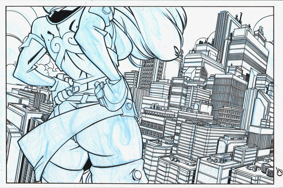
For the figure in the foreground: a solid pose. The arms must have been very difficult, but you nailed them. A very feminine pose with just enough sensuality to be interesting, but not overtly so (the proportions of the chest and butt are a little ridiculous for me, but that's just taste). I like the amount of underdrawing you have in blue-line; it's very good that you're thinking of her structure and mass.
While I'd assume you're going to color this, I think you should have given her some more shadows and spot-blacks (making the city the primary source for light would be the perfect solution to this). This would make her have lots of stark black/white contrast, which differentiates her from the skyline which is a mix of grey tones due to all the lines. Bumping up the line-weight on her would not kill it either. Some of the lines on her are the same thickness as some buildings, which isn't a good thing. Both of these would help separate her from the city even more, and help attract attention to her.
The city: Oh. My. God. That's amazing. I've done crazy skyline drawings before, so I know what you must have gone through to achieve this image. Very well done. The buildings are all unique from each other, and all look realistic in architecture. The perspective is spot on, there are no problems with that. Well chosen vanishing points. You made a good call with contrasting the geometry of the city to the organic-ness of her figure and the clouds. You balance the details of the buildings with good blank space to keep it from being muddy or busy.
One thing that I am a little worried about is that you got a little carried away with drawing buildings. I'm not sure if you intended this, but all the buildings are crammed one next to the other. There's no room for alleyways, roads, or the like. There is obviously a division between the skyline and whatever it is that Dynagirl is standing on, of course. Obviously, this is a minor issue, and it doesn't detract very much from the massive impressiveness of the skyline.
Overall, this is a good composition. It's a good example of the payoff an artist gets when extra time is taken for all those little details. Totally a portfolio piece. I am very impressed.